Periscope is now organized with what are called 'views'. This has replaced 'tabs' in the earlier revisions of Periscope. Views are context sensitive, meaning they will only be displayed depending on what context level they were assigned.
| Info |
|---|
Selecting the double arrow icon in the bottom left corner will expand or contract the left hand view pane to reveal the names of the views: |
Views can be added or modified by accessing the settings menu in the top right corner of the window, or by clicking the + button on the bottom-left.
While in the settings configuration, select the bottom icon to access the views. This will show you all the views that are currently set up, what their id is and the context they are associated with.
The Views main setting page is broken into 5 columns:
- Drag Handle: This can be used to re-order viewlets by clicking and dragging on a row.
- Icon: You can set whichever icon you'd like to best represent the view that you're building. Chose from dozens of options to best fit your project.
- Name: What you'd like to call your view.
- View ID: These id's are assigned to the components that are created for Niagara behind the scenes.
- Context: The assigned location that the particular view will reside and be visible when navigating. IE if you had a "Database" view assigned to the top level (^), you would see this view when you're on the 'home' page. If you added a "Dashboard" view on a site level (site) when you navigate to any site, that dashboard would be available on the left side menu. The top 'home' page would not have this dashboard view as it was assigned to the 'site' level and not the 'top' level.
Creating a View
When Creating a view, click the 'Add' button at the bottom of the view pane. You're given a choice of 7 different view types, as seen below.
Once you select the view you'd like to add, give it a name, a unique icon, and most importantly a target designation for context.
Available Views:
| Child pages (Children Display) |
|---|
View Controls
Views have unique controls that modify the data displayed. These controls include:
- Date Range: Allows changing the time frame of a view
- Timeline: Puts historical data in motion similar to a DVR
- Config: Contains additional options to modify the view behavior
Date Range
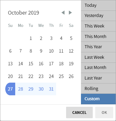
The Date Range selector allows the user to select a date range from a list of pre-configured date ranges. It also allows for the selecting of a custom date range by clicking "Custom", which causes a calendar component to appear.
Timeline
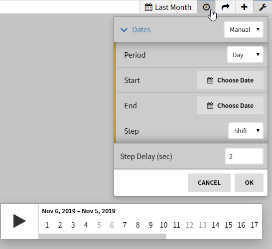
Selecting the clock icon will open up the animated timeline which you can play and see the changes as they happened over a set period of time.
The timeline settings (wrench) offer more control over the playback speed and timeline range. Options include:
- Dates: Choose previous number of days or manually select a date range to animate
- Period: What rollup interval to animate
- Step Delay: How quickly the animation moves through the timeline
Configuration
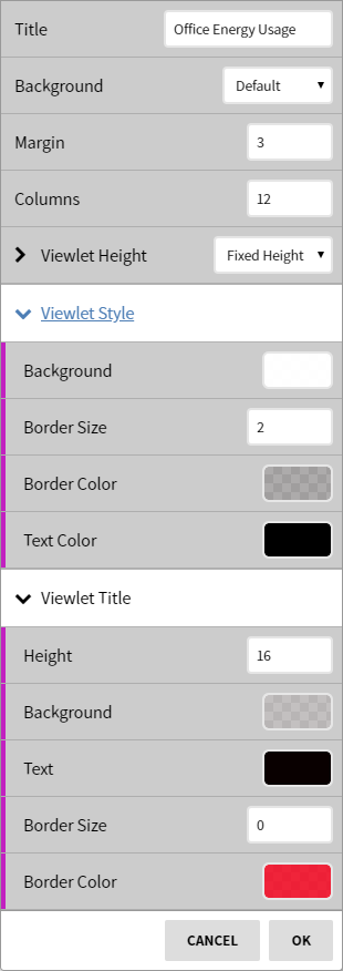
Selecting the wrench icon in the upper-right corner of a view will bring up the configuration menu. This view configuration will be unique to each view when modified.
Views and Viewlets with a Title configuration option can optionally use a template macro to show either:
- ${context}: the contextual display name of the current context level. Only works if inside of a context. On a site like "Barnard" this would show "Barnard" and then change as is appropriate when navigating contexts.
- ${dateRange}: the current view's date range display string. "Today", "Last Month", etc. Will change when the global date range selection changes.
| Note |
|---|
Some views may not have additional configuration |


