The Demand Duration Viewlet displays the amount of time a given variable has exceeded a specific value. The user will often look to eliminate peak values on the left side of the graph that only occur a minimal portion of the time. For instance, if kW demand spikes for 4 hours per month, the user may determine that a simple demand limit algorithm can prevent that peak from happening. The viewlet could also be used to determine how many hours per month a room temperature is above a specific point.

This example shows a high level of energy consumption, as indicated by the large portion of area under the left side of the graph. “Mousing” over the border of the duration graph presents the user with the length of time energy consumption was over the given value.
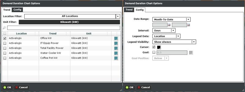
Demand Duration Configuration
The Demand Duration Viewlet has a relatively simple configuration menu. The user’s desired trend to be graphed is selected from a list which will appear once the trend button has been clicked. The graph’s color can also be set from a standard pop-up menu. Further configuration can be controlled through the viewlet window itself, as additional time rollups can be set using the menus below the X-axis.